A Guide to Customized Donor Plaques
- Steve Stobbe
- Aug 16, 2025
- 10 min read
Customized donor plaques do more than just put a name on a wall—they tell a story and make people feel like they truly belong.
Think of it like getting a handwritten thank-you note versus a generic email. One is just functional, but the other creates a real, human connection. For any organization, a thoughtfully designed plaque turns a simple name into a lasting symbol of appreciation.
The Power of Personalized Recognition
A recognition plaque isn't just an identifier; it's a way to build relationships and show everyone what your organization stands for. Whether it’s for a star employee, a generous donor, or a historic landmark, it’s a public nod that makes their contribution a tangible part of your story.
This simple act of recognition forges a deep sense of connection. For the person being honored, it’s validation that their effort mattered. For everyone else who sees it, it showcases the character of your organization—one that genuinely values its people and their impact.
Reinforcing Identity and Legacy
Custom recognition plaques are essential for building a visual narrative in your space. They serve as quiet, constant reminders of the people who have shaped your organization’s journey. This is especially true for donor recognition walls, where every single plaque represents a vital partnership.
A recognition plaque does more than honor an individual; it builds a bridge between your organization's past, present, and future, inspiring others to become part of the story.
Ultimately, these plaques are an investment in your community and your culture. They get to work by:
Strengthening Brand Identity: Consistent design and high-quality materials reflect your organization’s professionalism and eye for detail.
Encouraging Future Contributions: When you publicly celebrate donors and team members, it motivates others to step up with their time, talent, or resources.
Creating a Lasting Legacy: Plaques transform achievements that might have been fleeting moments into permanent fixtures, preserving your history for generations to come.
Choosing the Right Plaque Materials
Picking the right material for your plaques is a lot like choosing the right frame for a masterpiece painting. It sets the tone, reinforces the message, and can make or break the final impression. The material you select does more than just hold a name—it speaks volumes. It can communicate timeless tradition, sleek modernity, or a warm, down-to-earth feel.
Just think about it: a heavy, polished bronze plaque feels permanent and significant, a natural fit for a university’s centuries-old legacy. On the other hand, a clean, flame-polished acrylic plaque has a contemporary vibe, perfect for a tech startup’s headquarters. Each material tells a story before a single word is read.
Classic Metals for Lasting Prestige
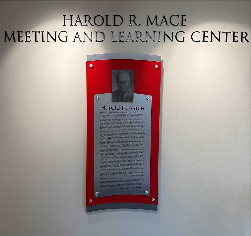
There's a reason metals like bronze, brass, and aluminum are the classics. They offer a sense of permanence and durability that’s hard to beat. Their physical weight and distinguished appearance make them a go-to for outdoor memorials, historic buildings, and top-tier donor recognition walls.
Bronze & Brass: These traditional choices have a warm, golden hue that develops a beautiful patina over time, adding to their character. They’re perfect for conveying a message of honor and tradition.
Aluminum: Lighter and more budget-friendly, aluminum offers a clean, silver finish. It’s also rust-resistant, making it a solid choice for both indoor and outdoor displays.
Modern Aesthetics with Acrylic and Glass
For a more modern, clean look, you can't go wrong with acrylic and glass. These materials offer a minimalist aesthetic that fits beautifully with contemporary architecture and design. They’re also incredibly versatile and can be customized in endless ways.
Acrylic plaques, for instance, can be crystal clear, frosted, or tinted with color, and they can be cut into almost any shape you can dream up. Glass provides a premium, high-end feel with its brilliant clarity. Both are fantastic for creating a floating, three-dimensional look when mounted with standoffs.
The material you choose is the first word in the story your plaque tells. Make sure it aligns with the tone and values of your organization's message.
Picking the right material is a big decision, so let's break down the common options.
Comparing Common Name Plaque Materials
This table gives a quick snapshot of the most popular materials, helping you weigh their look, feel, and long-term needs.
Material | Key Characteristics | Best For | Maintenance Level |
|---|---|---|---|
Metal | Heavy, durable, and traditional (bronze, brass, aluminum). | High-level donor walls, outdoor memorials, and historic buildings. | Medium to High |
Acrylic | Lightweight, modern, and highly versatile in shape/color. | Corporate offices, modern nonprofits, and layered, dimensional signs. | Low |
Glass | Premium, elegant, and sophisticated with excellent clarity. | Executive suites, high-end recognition, and minimalist designs. | Low |
Wood | Warm, organic, and unique with natural grain variations. | Community centers, schools, and organizations with a rustic feel. | Medium |
Ultimately, the best choice depends on the story you want to tell and the environment where the plaque will live.
The Natural Warmth of Wood
Wood brings an unmatched organic warmth and character to name plaques. Materials like oak, cherry, and walnut each have a distinct grain and color, which means no two plaques will ever be identical. An engraved wooden plaque is a wonderful choice for organizations that want to project a rustic, traditional, or eco-conscious image.
This material works beautifully for employee recognition, office door signs in a relaxed environment, or donor walls in nature preserves and community centers. Just be sure to choose the right protective finish, especially if the plaque will get a lot of direct sunlight. Making the right material choice is just one piece of the puzzle, so be sure to check out our guide on the top mistakes to avoid when creating a donor wall to get the full picture.
Designing a Plaque That Makes an Impact

Anyone can slap a name on a piece of metal, but great design turns a simple plaque into a real statement. It’s the difference between just listing a name and genuinely celebrating a contribution. Every choice—from the font to the spacing—works together to grab attention and tell a story with style.
Think of it like composing a piece of music. Every note and every pause has a purpose. In plaque design, things like typography, layout, and logos are your instruments. The goal is to create something that doesn't just get seen, but gets felt.
It all starts with understanding how visual elements shape our perceptions. A heavy, traditional font might feel right for a historic university, while a clean, minimalist look is a much better fit for a forward-thinking tech company.
The Language of Typography
Typography is basically the voice of your plaque. Before a single word is even read, the font you choose sets a tone and gives off a distinct personality. It’s an incredibly powerful tool that can communicate tradition, elegance, or modern simplicity.
For customized name plaques, you’ll mainly be looking at two font families:
Serif Fonts: Think classic fonts like Times New Roman or Garamond. They have those little decorative feet on the ends of the letters. These feel formal, established, and traditional—perfect for universities, law firms, or historical dedications.
Sans-Serif Fonts: These are the clean, modern fonts like Helvetica or Arial that don't have the decorative strokes. They look straightforward and contemporary, making them a great choice for corporate offices, hospitals, and any organization wanting to project a fresh image.
Scrpit Font: An elegant font enhances the plaque's aesthetic appeal and clarity. Its graceful curves and subtle flourishes create timeless beauty, making it a stunning focal point. Whether for an award or personal keepsake, this exquisite typeface leaves a lasting impression.
.

The most effective plaque designs often mix and match fonts. You might use a bold serif for the main name and a clean sans-serif for the description. This creates a clear visual hierarchy that naturally guides the viewer's eye.
Beyond just picking a font, you also need to think about kerning (the space between individual letters) and leading (the space between lines of text). Getting the spacing right is crucial. It prevents the text from feeling cramped and makes it far easier to read, especially from a few feet away.
Mastering Layout and Whitespace
Layout is all about arranging everything on the plaque to create balance and draw the eye where you want it to go. A cluttered plaque is an ignored plaque. It overwhelms the viewer and weakens the message.
This is where whitespace—the empty area around your text and logos—becomes your best friend.
Whitespace isn't just "blank" space. It’s an active design element that gives everything else room to breathe. It cuts down on visual noise, makes the text easier to digest, and pulls the viewer’s focus to the most important information. A generous use of whitespace always communicates sophistication and confidence.
Integrating Logos and Graphics
Adding a logo is a fantastic way to reinforce your brand and add a layer of visual interest. If you’re going to include one, make absolutely sure it’s a high-resolution vector file. This is non-negotiable. A vector can be scaled to any size without getting blurry, which is essential for a crisp, professional look whether it's printed or engraved.
The logo’s placement needs to feel intentional. It should complement the text, not fight with it for attention. Whether it’s tucked neatly in a corner or featured more prominently, its position should feel balanced and deliberate. The same goes for any other graphics, like a decorative border or an emblem—they should enhance the design, not distract from it.
Honoring Generosity on Donor Walls
One of the most powerful uses for custom name plaques is on a donor recognition wall. These aren't just lists of names; they're visual stories celebrating the community of people who fuel your mission. By using different plaque sizes, materials, or placements for various giving levels, you create a compelling visual narrative.
For instance, a large, prominent bronze plaque might honor a founding patron. A series of smaller, elegant acrylic plaques could recognize a growing group of annual supporters. This approach does two critical things at once:
It gives every contributor tangible, lasting acknowledgment.
It creates an aspirational model that can inspire future giving.
These walls do more than just say "thank you." They build a legacy. Crafting a display that truly connects requires careful planning, and you can get more insights from our guide on how to build a donor wall that tells a story.
Plaques as Markers of Time and Achievement
Beyond donor walls, plaques play a vital role in commemorating milestones and celebrating people. Their uses are incredibly diverse, making them essential in both corporate and community settings.
A well-designed plaque captures a specific moment—a grand opening, a milestone anniversary, or a personal achievement—and preserves its significance for everyone to see for years to come.
Consider these other powerful applications:
Memorial Plaques: A thoughtfully designed plaque in a quiet garden or on a park bench tells the story of a cherished individual, creating a permanent space for reflection.
Building Dedications: These plaques mark a major moment in an organization's history, forever linking a building to the people who made it possible.
Employee Recognition Awards: Forget generic trophies. A custom plaque is a distinguished and personal award that celebrates exceptional performance in a way that feels truly substantial.
In every case, the plaque acts as a powerful public statement. Research confirms this, with studies showing that around 75% of consumers remember a business specifically because of its signage. This just goes to show how a well-designed custom nameplate can stick in people's minds and reinforce who you are.
Getting the Installation and Display Just Right
You've got the perfect plaque—beautifully designed and crafted. But the job isn't done yet. How and where you display it is just as important as the plaque itself.
Think of it this way: a masterpiece deserves a great frame and the right spot on the wall. Poor placement or bad lighting can completely undermine an elegant design. Get it right, and you elevate not just the plaque, but the entire space.
Strategic Placement and Viewing Height
First things first: location. Where will your customized recognition plaques get seen and appreciated? Look for high-traffic spots like reception areas, main hallways, or central courtyards. The last thing you want is for your tribute to be tucked away in a dimly lit corner or lost on a cluttered wall.
Next up is height. There's a reason museums hang artwork the way they do. The gold standard is to center the plaque at 57 to 60 inches from the floor. This is eye-level for most people, making it easy and comfortable to view without having to crane their necks or bend down.
Proper lighting is the secret ingredient. It can make the texture of the material pop, bring out the engraving, and ensure your tribute looks stunning, day or night.
Here are a few lighting tricks to make your plaque shine:
Spotlighting: Use a dedicated spotlight to create a dramatic, focused look. It really draws the eye.
Wash Lighting: For a larger donor wall, a softer wash of light creates an even, ambient glow across the entire display.
Natural Light: Placing a plaque near a window can be beautiful, but be careful. Direct sunlight can create glare and might even damage certain materials over time..
A Few Common Questions About Name Plaques
When you're getting ready to order customized recognition plaques, a few questions almost always come up. Getting these details sorted out from the start makes the whole process smoother and ensures the final result is exactly what you envisioned.
Let's walk through some of the most common points, from timelines to upkeep.
What Is the Typical Turnaround Time?
This really depends on the material you choose and how complex the design is. Something straightforward, like a simple engraved acrylic plaque, might only take 3-5 business days to produce.
But for a more intricate piece, like a cast bronze plaque, you're looking at a longer timeline—often 3-4 weeks. Always check with your supplier on their estimated production time, especially if you have a dedication ceremony or event on the calendar. Planning ahead is the best way to avoid rush fees.
Pro Tip: When you ask for a quote, ask for a production and shipping timeline, too. It helps you build a realistic project schedule right from the beginning..
Can I Use My Own Logo or Design?
Absolutely. In fact, most suppliers encourage it! To get the sharpest, cleanest result, you’ll want to provide your artwork as a high-resolution vector file. Look for file types like .AI, .EPS, or .SVG.
Vector files ensure your logo can be scaled to any size without getting blurry or pixelated during the engraving or printing process. Your vendor should always send you a digital proof to approve before they start making anything.
Ready to create a lasting tribute? The team at Stobbe Design specializes in crafting beautiful, high-quality recognition displays that honor your community and tell your story. Explore our portfolio and start your project today.

Comments