Designing a Recognition Wall Plaque That Inspires
- Steve Stobbe
- Oct 8, 2025
- 13 min read
A recognition wall plaque is so much more than a list of names. It’s a storyteller, a physical representation of your organization's gratitude that turns a simple wall into a landmark. It's a way to celebrate donors, employees, or pivotal milestones in a way that truly lasts.
Whether you choose timeless bronze or sleek, modern acrylic, a well-designed plaque becomes a permanent tribute—one that inspires and engages everyone who sees it.

Establishing Your Plaque's Purpose and Vision
Before you even think about materials or fonts, the first and most critical step is to nail down the "why" behind your recognition wall plaque. This foundational clarity will steer every other decision you make, from the tone of the inscription to where you finally hang it.
Are you looking to honor the foundational donors whose generosity quite literally built your organization? Or is the goal to celebrate your top-performing employees and light a fire under the rest of the team?
A plaque commemorating a historic event will feel completely different from one designed as an ongoing tribute to annual supporters. Defining this purpose from the get-go ensures the final piece connects with its audience and sends the right message, loud and clear.
Defining Your Core Message
With your main goal set, you can start shaping the core message. This is the story your plaque is going to tell. Ask yourself what kind of feeling you want people to walk away with. Should it inspire future giving, create a stronger sense of belonging, or serve as a quiet, solemn memorial?
The message you choose will dictate the entire scope of the project.
For Donors: The story will likely center on gratitude, legacy, and community impact.
For Employees: You'll probably focus on themes of achievement, dedication, and excellence.
For Milestones: The narrative would naturally revolve around history, progress, and a vision for the future.
Getting this story straight is essential before you start writing the text. If you need a little help finding the right words, our guide offers some powerful examples of plaque dedication wording to inspire you.
The plaques that really work are the ones that tell a story. They turn names on a wall into active participants in your organization's journey, which strengthens emotional connections and encourages others to get involved.
Aligning with Organizational Culture
Finally, your recognition plaque has to feel like it belongs. It needs to be an authentic extension of your organization's brand and culture. A forward-thinking tech startup might go for a sleek, interactive digital display, while a historic university would almost certainly lean toward traditional cast bronze.
When the design aligns with your identity, the plaque feels genuine and perfectly integrated into its surroundings. It just makes sense.
This is where physical recognition really shines. One study actually found that employees are 3 times more likely to remember being recognized when the experience includes a symbolic award like a plaque. It makes the appreciation tangible and solidifies the moment in a way an email or a verbal "thank you" never could.
Choosing Materials That Tell a Compelling Story
The material you choose for a recognition plaque is so much more than a background for names—it's the first word in the story you're telling. It communicates permanence, innovation, tradition, or warmth before anyone reads a single word. Your choice needs to be a direct reflection of your organization's identity and the very significance of the honor itself.
Think about it. A historic university will almost always lean into the heft and timeless elegance of cast bronze. Why? Because it conveys a sense of legacy and endurance. On the other hand, a modern healthcare foundation might opt for the clean, bright look of acrylic or glass to communicate clarity and a forward-thinking vision. Every material has a personality.
Matching Materials to Your Message
The right material amplifies the feeling you want to evoke. Is it prestige and authority, or approachability and warmth?
Metal (Bronze, Brass, Aluminum, Stainless Steel): These are the classics for a reason. They suggest permanence, strength, and prestige. Bronze, in particular, develops a rich patina over time, which only adds to its character and sense of history.
Wood (Oak, Maple, Walnut, Cherry): Wood brings a natural warmth and an organic feel to any space. It can feel traditional or contemporary depending on the finish and design, and we often see it used to signify growth, community, and steadfastness.
Acrylic & Glass: These options provide a sleek, modern, and often minimalist aesthetic. They're excellent for creating a sense of transparency and light, making them popular in contemporary corporate or medical settings where a clean, sophisticated look is paramount.
Practical Considerations for Durability and Design
Beyond the look and feel, practical factors like location, maintenance, and design complexity will absolutely guide your decision. A recognition plaque in a high-traffic lobby needs to be far more durable than one tucked away in a quiet boardroom.
For instance, cast bronze is incredibly tough and ideal for those busy, public-facing areas. Its timeless appeal makes it a frequent choice for significant honors. If you're considering this enduring option, you can explore our the definitive guide to cast bronze plaques to see if it fits your vision. Stainless steel is another excellent high-durability choice, offering a modern look that resists scratches and corrosion beautifully.
To help you weigh the pros and cons, here’s a quick reference table.
Material Selection Guide for Recognition Plaques
Material | Aesthetic & Feel | Best For | Durability & Maintenance |
|---|---|---|---|
Bronze/Brass | Classic, traditional, prestigious. Develops a rich patina over time. | Universities, government buildings, historical landmarks, major donor recognition. | Extremely durable, suitable for indoors/outdoors. Requires occasional polishing. |
Aluminum | Modern, lightweight, sleek. Can be finished in various colors. | Corporate offices, tech companies, contemporary spaces requiring a clean look. | Very durable and corrosion-resistant. Low maintenance. |
Wood | Warm, natural, and inviting. Can be rustic or highly polished. | Non-profits, schools, community centers, organizations focused on nature or growth. | Best for indoor use. Requires periodic cleaning and can be susceptible to scratches. |
Acrylic/Glass | Modern, transparent, clean, and airy. | Healthcare facilities, research labs, minimalist corporate settings, tech startups. | Durable, but can scratch. Glass is heavier and more fragile. Easy to clean. |
This table provides a great starting point, but always think about your specific environment.
Pro Tip: Always, always consider the existing lighting in your chosen space. Polished metals and glass can create a distracting glare under direct spotlights, while matte finishes or certain woods can absorb light and appear dim in a poorly lit area. The best thing you can do is request material samples to test them out in the actual location.
Finally, think about your design's complexity. Intricate logos or detailed text are often best rendered with chemical etching on metal or laser engraving on acrylic. If you need to incorporate vibrant, full-color graphics, direct printing onto an acrylic or metal substrate is probably the way to go. Your fabrication partner can help you match the best material to your specific artistic needs, ensuring the final product is both beautiful and built to last.
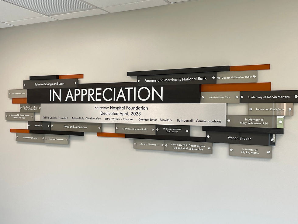
Designing a Layout That Commands Attention

Once you’ve locked in the perfect material, it’s time to shape how your story will be told visually. The layout of a recognition plaque is its most powerful communication tool—it’s what separates a simple list of names from a compelling tribute. A great design guides the eye, sparks an emotional connection, and makes sure your message of gratitude lands in an instant.
Let’s be honest, a cluttered or confusing layout can torpedo the entire project. It can make a heartfelt thank-you feel like a disorganized spreadsheet. The real goal is to create a visual masterpiece that’s both beautiful and functional, turning a plaque into a true centerpiece for your space.
Mastering Visual Hierarchy
Visual hierarchy is just a fancy way of saying you’re arranging things to show what’s most important. For a plaque, this means making sure the most critical information—like a top-tier donor’s name or the purpose of the award—is the very first thing people notice.
You can pull this off with a few simple but incredibly effective techniques:
Size and Scale: Go big with the most important elements. The main title or the highest donor level should be noticeably larger than individual names or descriptive text.
Font Weight and Style: Use bold or unique fonts for key information. Imagine a bold, classic serif font for a family name, paired with a lighter sans-serif for the donation year—that contrast creates instant clarity.
Strategic Placement: Our eyes are naturally drawn to the top and center of a design. Put your primary message right in that prime real estate to grab immediate attention.
Think of it like a newspaper headline. You know the main story at a glance because of its size and placement. The exact same principle applies to your plaque design.
Balancing Text, Logos, and Negative Space
One of the biggest mistakes I see is people trying to cram way too much onto one plaque. The most elegant and impactful designs I’ve ever worked on have one thing in common: they embrace negative space. That's the empty area around your text and logos. This “breathing room” is absolutely essential for readability and achieving a clean, sophisticated look.
When you’re working with logos, make sure they feel balanced with the text. A massive corporate logo next to a tiny donor’s name can feel awkward and cheapens the personal recognition. You're aiming for a harmonious relationship between every element on the plaque.
A well-designed plaque doesn't just present information; it creates an experience. The thoughtful use of space, typography, and hierarchy transforms a list of names into a powerful statement of appreciation that feels both significant and sincere.
Planning for the Future with Modular Design
For any ongoing recognition program, a static, one-and-done plaque can become outdated almost as soon as it’s installed. This is where a modular design is a lifesaver. It’s a system literally built for growth, allowing you to add new names or elements over time without having to rip everything off the wall and start over.
Typically, this involves a main header plaque that establishes the award's purpose. Then, as you recognize new honorees, you simply add individual nameplates crafted from the same material and with consistent typography. This approach keeps your recognition wall dynamic and relevant for years to come.
This focus on adaptability reflects a bigger shift in how organizations show appreciation. We're moving away from one-size-fits-all recognition toward more customized, personal approaches. As the O.C. Tanner 2023 Global Culture Report highlights, this trend is vital because it makes acknowledgment feel far more meaningful. By designing a layout that’s not only beautiful today but also ready for tomorrow, you create a true, lasting legacy of gratitude.
Bringing Your Vision to Life: The Fabrication and Engraving Process
This is where the magic happens—where your carefully crafted digital design starts its journey into a tangible, physical object. The fabrication method you and your partner choose will define the final look, feel, and even the lifespan of your recognition wall plaque. Getting familiar with the key techniques will make your conversations with potential vendors much more productive.
There are a few classic methods, each with its own character. Casting, for instance, is a time-honored technique for bronze plaques where molten metal is poured into a custom mold. This creates a single, solid piece with raised lettering and borders, giving it that substantial, three-dimensional quality perfect for prestigious awards.
Another popular choice is chemical etching. This precise technique uses acid to carve into exposed metal, creating incredibly sharp, recessed text and graphics. It’s an ideal solution for intricate logos or detailed designs on materials like stainless steel or brass.
Exploring Modern Engraving Techniques
Today, laser engraving has become a go-to for many projects, and for good reason. A high-powered laser etches the material’s surface with surgical precision, delivering crisp, clean details on wood, metal, and acrylic.
The versatility is what really makes this method shine, as it can handle a huge range of fonts and complex images. For example, creating **personalized acrylic plaques with unique custom awards** is often best achieved with a laser, which can produce that beautiful, clean frosted lettering on a clear background.
When you're comparing vendors, don’t just look at their finished work—ask them how they do it. A reputable fabricator will be more than happy to walk you through why they recommend one technique over another for your specific design and material.
Choosing the Right Fabrication Partner
Picking the right vendor is every bit as important as the design itself. This fabricator is your partner in bringing a vision to life, so it pays to do your homework. Start by digging into their portfolio. Do their past projects have the same style and quality you're aiming for?
Go beyond their online gallery and always request material samples. A small piece of etched zinc or cast bronze looks completely different on a website versus in your hand, under your building's actual lighting. It’s a simple step that can save you from costly headaches down the road.
A great fabricator does more than just make the plaque; they act as a consultant. They should be able to spot potential issues in your design file, suggest finishing options you hadn't considered, and provide a clear, realistic timeline from proofing to delivery.
Before you sign on the dotted line, make sure you have solid answers to a few key questions:
What is your proofing process? You should always get a digital proof to sign off on before anything goes into production.
What are the estimated timelines for production and shipping?
What protective coatings or finishes do you recommend for our material and its location?
Can you guarantee color and material consistency for future additions? This is absolutely vital if you're building a modular plaque over time.
Asking these questions upfront sets the stage for a smooth collaboration, ensuring the final recognition wall plaque not only meets but truly exceeds your expectations for quality and craftsmanship.
Planning for a Flawless Installation
This is where your vision comes to life. A thoughtful installation is what separates a beautiful plaque from a truly breathtaking focal point in your space. Getting this last part right isn't just about looks—it's about ensuring the security and longevity of your investment for years to come.
Your first move is to meticulously prepare the installation site. Don't just look for an empty spot on the wall. Think about foot traffic, natural sightlines, and accessibility. You want the plaque where it will be seen and appreciated, but not in a high-traffic corridor where it's at risk of getting bumped or damaged.
For heavier pieces, especially those made from solid bronze or thick glass, wall reinforcement is non-negotiable. This might mean adding a plywood backer behind the drywall or making sure the mounting hardware anchors directly into the wall studs. A professional installer can take one look at the wall, assess its integrity, and tell you exactly what’s needed to support the plaque's weight securely.
Choosing the Right Mounting System
How you hang your plaque can dramatically change its final look. The hardware you choose isn’t just functional; it’s a design element that contributes to the overall aesthetic.
Standoff Mounts: These are small metal cylinders that create a gap between the plaque and the wall, giving it a modern, "floating" appearance. The subtle shadows they cast add a real sense of depth. Standoffs are a fantastic choice for acrylic and glass plaques.
Flush Mounts: With this method, the hardware is completely hidden behind the plaque. This creates a seamless, integrated look that’s perfect for traditional wood or metal plaques where you want a classic, built-in feel.
Z-Clips: Also known as French cleats, these interlocking brackets offer an incredibly secure and hidden mounting solution. As a bonus, they make it relatively easy to remove the plaque later if you ever need to.
The right mounting hardware should complement your design, not distract from it. Always have this conversation with your fabricator early on, as they can drill the plaque to precisely match the hardware you select.
The Power of Strategic Lighting
Never, ever underestimate the role of lighting. The right illumination can transform your recognition plaque from a static object into a dynamic centerpiece. A well-placed spotlight can highlight the intricate details of an engraving, bring out the rich texture of wood, or make the polished edges of an acrylic plaque absolutely gleam.
When thinking about lighting, consider options like adjustable track lighting or dedicated art lights. These give you the flexibility to aim the light perfectly, avoiding glare and ensuring every name on the plaque is crystal clear and legible.
This kind of attention to detail reflects a much larger trend. The appreciation for beautifully presented wall displays is growing, with the global wall art market valued at approximately $63.61 billion in 2024. As this market expands, so does the demand for flawless installations like a custom recognition wall plaque. For more context, you can explore the full findings on the wall art market from Fortune Business Insights. By investing in a perfect installation, you’re ensuring your tribute commands the attention it truly deserves.
Common Questions We Hear About Recognition Walls
When you’re planning a new recognition wall, a few key questions almost always pop up. I get it—navigating the process for a custom installation can feel like a lot, but getting clear answers upfront helps you move forward with confidence and sidestep some common pitfalls.
Here’s some straightforward advice I’ve shared with clients over the years to help you nail the details and make sure your project is a success from start to finish.
How Can I Create a Plaque That Can Be Updated with New Names?
This is easily one of the most practical and important things to figure out, especially for any ongoing recognition program. The short answer is a modular design.
This approach typically involves a main header plaque that sets the tone—explaining the award, the fund, or the campaign—which is then paired with individual nameplates that you can add as new donors or honorees come on board.
It's what keeps the wall a living, evolving tribute rather than a static piece frozen in time. The most critical part of this is confirming that your vendor can consistently reproduce the exact same size, font, and material finish for every future addition. That commitment to consistency is what maintains a cohesive and professional look as your wall of honor grows over the years.
What Is the Most Durable Material for a High-Traffic Area?
For a busy lobby, a main hallway, or any public-facing space, durability is everything. You need something that can handle the daily hustle. My two go-to recommendations are always cast bronze and etched stainless steel.
Cast Bronze: This material is incredibly tough and classic. It stands up to just about anything and develops a beautiful patina over time that only adds to its character.
Stainless Steel: For a more modern aesthetic, this is a fantastic choice. It does a great job of resisting scratches, corrosion, and even fingerprints.
Both of these options require very little maintenance to keep them looking pristine. While acrylic can provide a sleek, contemporary look, it’s far more susceptible to scratching and probably isn’t the best choice for areas where people might brush up against it.
A recognition wall plaque in a prominent location becomes a part of the building's identity. Choosing a material that can withstand daily life ensures that the honor you're conveying remains undiminished by wear and tear.
How Much Should I Budget for a Custom Plaque?
This is the big question, and the honest answer is: it varies—a lot. The final price tag really comes down to three key factors: size, material, and design complexity.
A small, simply engraved acrylic plaque might only run you a few hundred dollars. On the other hand, a large, intricate cast bronze donor wall can easily cost several thousand dollars or more.
The main cost drivers are the raw materials, the level of detail in the design (like custom logos or unique shapes), and the manufacturing process required to create it. Because the range is so wide, I always advise clients to get detailed, itemized quotes from at least three reputable fabricators. This lets you compare your options and find a solution that truly aligns with both your budget and your vision.
At Stobbe Design, we specialize in creating custom recognition walls that beautifully honor your supporters and tell your organization's unique story. From initial concept to flawless installation, we are your dedicated partners in crafting a lasting tribute. Learn how we can bring your vision to life at stobbedesign.com.

Comments